You look fabulous in red. Or purple may make your heart sing. But green is calling to you recently.
In all the colors we have to play with in creating our historical costumes, how do you decide what to use? What shades are complimentary to each other? Will they “look period”?
And how do you take a source of inspiration and change the color successfully in your re-creation?
When I was starting out making many of my own clothes when I was a teen I found myself often looking for fabric to match what I saw on the pattern envelope. It wasn’t easy for me to think of other colorways or trim ideas.
(I’ll confess it’s still difficult for me as I’m mainly an engineer rather than designer.)
I use a TON of fashion plates as inspiration for my historical creations. Museum garments are used often too in my sewing room.
Rightly so, there is a purpose of using fashion plates and copying their colors.
Side note: fashion plates in the 19th century were hand tinted by various women in their homes and each chose colors she liked. This is why you’ll see the same fashion plate presented in different colors.
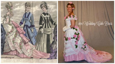
I’ll admit to duplicating fashion plates in both their design and colors. In my reproduction of the July 1876 evening gown from Godey’s I searched for the same pink silk taffeta to use.
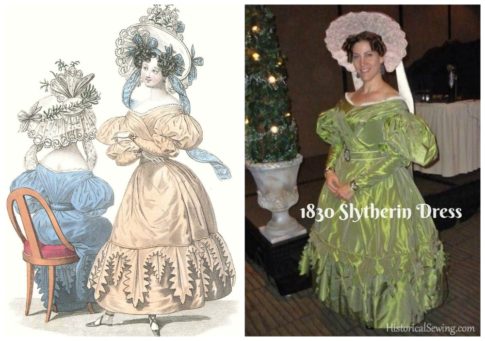
In neutral or light colored plates it becomes easier to go “off book” and do your own color palette. My 1830 Slytherin Dress was from a plate colored in a creamy beige.
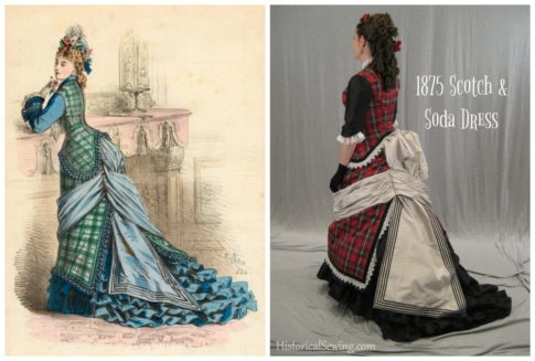
Yet, with the plate reproduction project of my 1875 Scotch & Soda Dress I knew I wanted a plaid and built around my family’s red MacGregor tartan sett.
So, what if you are really stuck with selecting a color palette? A couple options to consider:
Get out the colored pencils or crayons and play with black & white copies of fashion plates. You can find them in books (Dover ones are especially the ones to look for.) Or simply make a copy of your favorite plate by printing in black & white.
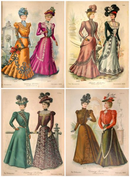
Look at other plates of similar styles from the same period.
Needing evening gown colors? Look at both plates and original garments to find a selection to choose from. Go for the set that makes your heart happy.
The Victorians loved some crazy color combos that appear hideous to our modern eyes. Ask yourself if you want to take a risk and do the same. Or perhaps you’ll stay subtle with general shades and modest trim.
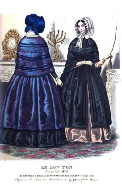
Think about the colors that look good on you. What’s in your contemporary closet? Do you get compliments when wearing yellows? Or greens? Do you match to your eyes with your modern blouses?
If you’re unsure of main colors and don’t want to be “risky” with your choices, stay with neutrals for the main color and concentrate on trims and accents.
Generally, a Victorian ensemble will have one main color and one or two contrast ones. In more neutral color schemes an unexpected contrast will give you that “pop” of color that creates a masterpiece design. Lime green with subtle brown or a spot of brilliant red on a gray base are two examples.
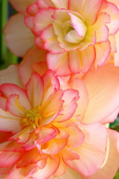
And finally, look to nature when in doubt. God has given us gorgeous color palettes right outside our door. No need to agonize over what goes with what.
Sunsets, flowers, greenery, forests, oceans, rocks, trees, vegetables & fruits, mountains, clouds, rivers, and so on. All with perfect color schemes for you to adapt into a fashion project.
Do you struggle with selecting colors for a historical project? Or is that a step you love to put together? Have you made a project with questionable colors at the beginning but it turned out fabulous? Tell us about it!

how did you go about making the flowers for the wedding cake dress, for I am looking into doing a dress that has a similar “trim”
Hi Amanda,
They are simple “cabochon” roses made from ribbons. Basically gathered on one long side of ribbon length then rolled around and tacked to a square of crinoline to hold. You can find instructions on YouTube I’m sure, or in Candice Kling’s wonderful book. 🙂
thank you I’ll look it up 🙂
I got interested in historical costume right after I had my first child, so I haven’t put together an outfit yet, but I have designed and sewn purses and bags for years. Fabric choice is unpredictable for me; sometimes the right things jump out at me but sometimes I end up keeping a design for months before I find the fabric that works, even though purses don’t have the added complication of making sure the colors look good ON a person.
My art teacher once told me to learn the rules and then learn how to break them. I didn’t understand what he meant at the time. One of my favorite purses started with an orange that was almost that bright hunter orange. I finally used a deep red and a light green binding with it, which I was drawn to despite thinking they clashed. I mean, the red looked good with the orange, and the green looked good with the orange, but that green with that red made me cringe a little. A couple days later, out on a walk, I looked down and saw a fallen maple seed that was orange, red, and green. I took it home and it matched my purse colors EXACTLY.
Since then I have chosen many combinations that do not match the recommendations of a color wheel, and they still work. Often I choose the dominant color, then two colors that match the base, but not necessarily each other, like with the maple seed purse. My favorites are always combinations that also occur outdoors. Next time you see a beautiful sunset, really identify the colors. There are some truly ugly colors in beautiful things! When trying colors together, put things next to each other that you think do. not. match. Pastel blue with saturated pink? Two kinds of stripes? I know someone who tried on a skirt and top and said delightedly, “Doesn’t it clash beautifully?”
Given a chance to make my own historical costume, I will probably find a half dozen color combos I like, then be forced to choose one based on fabric availability!
I say: Follow your heart! And nature truly is the best inspiration for colors. 🙂
I have strong preferences in colors and my modern wardrobe really reflects that. It’s not really any different from the Victorian dresses I like. Generally, I like the Victorian color scheme but some just don’t look right….. pink and light blue is one combination we don’t see today but this fashion plate is the craziest I’ve seen. I wonder what the average Victorian woman thought of it because sometimes crazy things are put in magazines.
The Victorians certainly did have some unusual color combinations!
Choosing colours is always the hardest part! If I can I will bring a friend to the fabric shop, if not I will just come home with loads of swatches and no fabric, and the agonize over all the swatches for a week or two.
I am the same way. I will shop with my mom because up until a year ago I was a minor and my mother wanted any excuse to spend time with her teenage daughter. As a brake during studying for fall finals I would look at Pinterest and fabric websites trying to pick and asked my high school friend for her opinion on things. She was very little help. I have come to one conclusion the waistcoat or vest is going to be made of night jade silk tissue taffeta. I have spent about a month trying to pick the walking suit fabric and color. The one problem I have is that my sensitive skin breaks out in rashes every time I touch wool. I really want to use a wool suiting but and too scared to make an beautiful outfit for a pretty penny and breakout in a rash.
I am horrible with colours, if left to my own devices I stick with indigo, black, and brown. My solution has been to have my husband pick the colours. He loves wild combinations and violent contrasts that always work out perfectly in the end.